
Bridging Data Analytics and UX Design: Crafting Intuitive Dashboards
Dashboards are where data meets action. They distill complex datasets into visuals, helping users make decisions quickly. But a dashboard’s success isn’t just about the quality of its data—it’s about how that data is presented. Thoughtful UX design is the bridge that connects information to usability, transforming dashboards from functional tools into indispensable ones.
At their best, dashboards do more than display data. They guide users, encourage exploration, and make insights accessible to everyone. To achieve this, they must be intuitive, balancing clarity and functionality in every detail.
Data Without Usability Falls Flat
Imagine opening a dashboard with dozens of widgets, endless scrolling, and inconsistent colour schemes. Even if the data is accurate, the experience can feel overwhelming. When users struggle to navigate a dashboard or interpret its visuals, its purpose is lost.
The goal of UX design is to prevent this from happening. A well-designed dashboard doesn’t just show data—it simplifies it. It helps users focus on what’s important, find answers quickly, and trust the information they see.
Take a sales dashboard, for example. A cluttered interface might bury key metrics like revenue and profit among secondary details. But with effective UX design, the most critical data appears prominently, guiding the user’s attention naturally.

Principles of Intuitive Dashboard Design
Crafting intuitive dashboards requires understanding both data and user behaviour. Thoughtful UX design incorporates principles like:
Hierarchy and Clarity
Not all data points are equal. Highlighting key metrics, such as total revenue or customer churn rate, ensures users see what matters most first. Supporting details should be accessible but not distracting.
Consistency
Fonts, colours, and layouts should remain consistent across the dashboard. This reduces cognitive load, allowing users to focus on the data instead of deciphering the interface.
Interactivity
Interactive elements like filters, drill-downs, and tooltips add depth to dashboards. These features let users explore data on their terms, uncovering patterns or details that static visuals might miss.
Responsiveness
Dashboards must adapt seamlessly to different devices. Whether accessed on a desktop or mobile phone, the experience should feel intuitive and complete.
The Role of UX in Visualizing Data
Data analytics is a powerful tool, but its impact depends on how it’s delivered. UX design ensures that the delivery is clear, efficient, and engaging. Consider these examples:
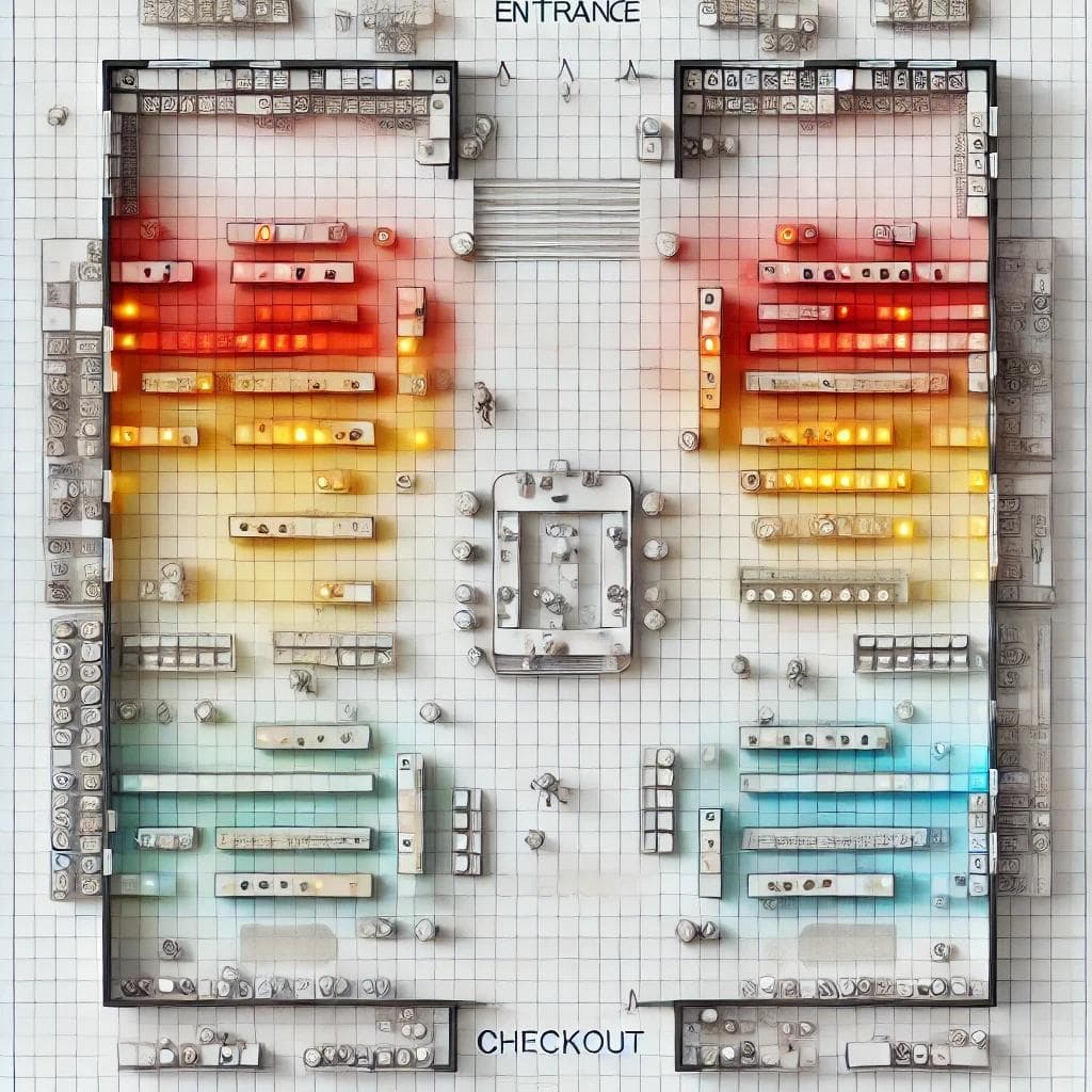
- Heatmaps in Retail: A heatmap showing foot traffic in a store can reveal which sections are most popular. If designed well, the map uses colour intensity and simple labels to convey this at a glance. Poorly designed heatmaps, on the other hand, might overcomplicate things, with too many colours or unclear legends.
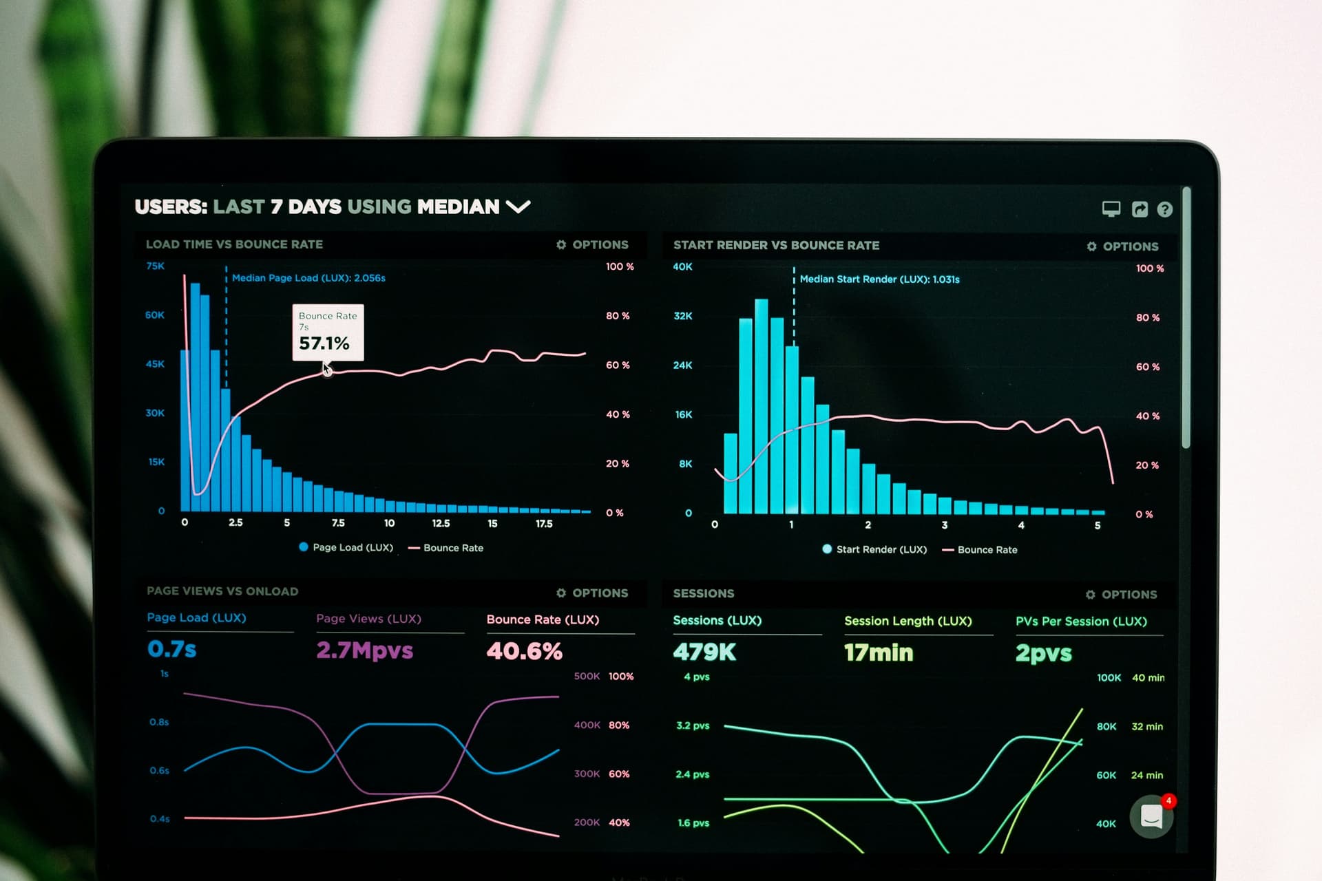
- Financial Dashboards: In finance, dashboards track volatile markets and investment portfolios. Good UX design ensures users can see trends quickly—by grouping related data, choosing appropriate visualizations, and offering easy filtering options.
These examples show how thoughtful UX design helps users connect with data in meaningful ways.
A Collaboration Between Data and Design
Creating intuitive dashboards requires a partnership between data analysts and UX designers. Analysts ensure the data is accurate and meaningful, while designers focus on how users interact with it. Together, they create tools that are both functional and user-friendly.
Technologies like D3.js often play a key role in this process. With D3.js, developers can create custom visualizations that align perfectly with design goals. Instead of forcing data into pre-built templates, they can tailor dashboards to fit user needs.
Why It Matters
In a world where decisions increasingly rely on data, dashboards must empower users—not confuse them. UX design ensures that even the most complex datasets are approachable. It turns raw numbers into clear stories and transforms dashboards into tools people want to use.
As dashboards become more advanced, UX design will remain central to their success. Features like machine learning and predictive analytics can enhance functionality, but they must be delivered in ways that feel natural. Without good design, even the most innovative dashboards can fall short.
By focusing on the intersection of data analytics and UX design, we can create dashboards that truly make an impact. They won’t just show data; they’ll help users understand it, trust it, and act on it. And that’s the real power of an intuitive dashboard.